
Top 5 Tips for Choosing Typography That Showcases Your Brand
Why Typography Matters
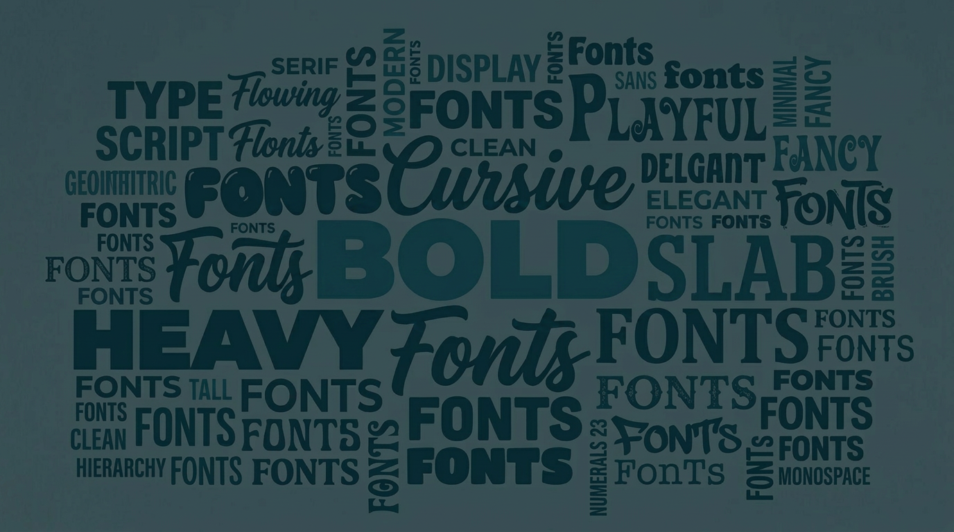
Typography might seem like a small detail, but it quietly shapes how people feel about your business before they read a single word. The right fonts can make you feel modern, trustworthy, playful, or high-end. The wrong ones? Confusing at best, off-putting at worst.
Here’s how to choose typography that actually supports your brand:
1. Start with your brand personality
Are you bold and modern? Soft and elegant? Fun and quirky? Your font choices should reflect that. A law firm and a yoga studio shouldn’t feel the same and your typography is a big part of that difference.
2. Keep it simple (2–3 fonts max)
More fonts don’t equal more personality, they usually equal chaos. Stick to a primary font (for headings), a secondary font (for body text), and maybe one accent font if needed.
3. Prioritize readability
A beautiful font that’s hard to read won’t do you any favors. Especially on websites, clarity always wins. If people have to work to read your content, they won’t stick around.
4. Think about where it lives
Your typography needs to work everywhere from your website to social media to your print materials. Make sure your fonts translate well across platforms and sizes.
5. Be consistent
Consistency builds recognition. When your fonts stay the same across everything you create, your brand starts to feel more polished and trustworthy.
Bottom line: Your typography should feel like an extension of your brand voice quietly reinforcing who you are in every word.